Sunday, 8 October 2017

Jon Daniels (1966 to 2017)


Jon Daniels and me at his Afro Supa Hero Exhibition
Liverpool Slavery Museum 26th May 2016
It was with deep sadness I read of the passing of Jon Daniels on Facebook last week.

I first came across Jon at his exhibition for the Children's Museum which I wrote about on this blog. I was deeply impressed by his aesthetic vision and his love of the black presence in comic books. He combined the two in his wonderfully iconic Afro Supa heroes series. I’m proud of the Afro Supa badge on my hold all.

Jon used an individual, almost idiosyncratic colour palette in his designs - his pastel blues , yellows , green within clearly defined forms and shapes where distinctive , characteristic of Jon - his trademark. The redesign of the facia of  Brixton Advice Centre on Railton Road in Brixton was quintessential Jon - combining his design style with a cultural message - I had to record it for my blog.
                                   

Jon made a lasting contribution to my John Blanke Project not just in his A4 , black and white, interpretation of John Blanke as the 'trump card' - one of the most distinctive but, also in his advice and guidance. I named the Project’s social media Twitter and Facebook accounts WhoIsJohnBlanke on advice from Jon as he saw the project as asking questions as to who really was John Blanke, this thought process led me to the Project’s strapline - Imagine the black Tudor trumpeter.

I’ll miss Jon, he had such a brilliant, creative mind who used his design ideas in the most inventive and original ways to communicate with us. I and the John Blanke Project are all the better for having met him. I will always miss him.

Tuesday, 6 June 2017

Pauline Griffith's Umbrellas

Pauline Griffiths
I love art that makes connections and that has purpose but Pauline Griffith’s practice makes finding the links with lived life challenging , equally many of the reasons as to why Pauline does her work are not immediately apparent. Yet despite the absence of an obvious intention or purpose her work has a  subliminally pleasing attraction  perhaps rooted in English idyosyncracity found in artists like Vivienne Westwood, George & Gilbert and the man who paints chewing gum – Ben Wilson - who I've written about elsewhere on this blog.

Pauline Introduces Her Practice

Pauline dismantles old or broken umbrellas with a view to making the fabric into bags while leaving their frames to create an object d’art. I caught her in the grounds of Guys Hospital at the first stage in her artistic work flow.


Pauline and Umbrella Frames
Should Pauline put half the energy and vitality that she puts into the dismantling  those broken umbrellas into the completed  bags they will be works of art which will at once delight and entertain not to mention have a planet saving recycling intrinsic utility

I plan to keep in touch with Pauline to follow her progress – meanwhile don’t throw away that broken umbrella as you maybe throwing a future work of art.

Monday, 15 May 2017

Learnt from Las Vegas, Applied in London and Liverpool


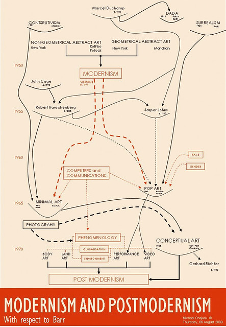
Preparing for my first Image of the Black in London Galleries tour I looked at how the postmodern influence behind  the Sainsbury Wing extension to the National Gallery was rooted in Robert Venturi’s 1972 influential work Learning From Las Vegas.


Welcome to Fabulous Las Vegas sign,
Betty Willis 1959
His radical ideas from consideration of the famous Las Vegas Strip with its iconic welcome sign gave way to a new way of thinking about urban architecture as he parodied modernism’s minimalism saying Less is a Bore! The Strip inspired him as buildings made their function and presence known through extravagant individual signage on its buildings.

Stardust sign and hotel front,
Las Vegas, 1961
Where modernism was about space Venturi argued postmodernism was about communication. A Mies van der Rohe modernist building had an intrinsic indifference to its history and location, it could be in any urban space, leading to the modern city having a uniform look and feel regardless of location from London to Los Angeles (or Liverpool).

The Mint. Las Vegas 1957 to 1989
Postmodernism was about context with its buildings fitting in a fun, idiosyncratic way within the settings they found themselves, letting the world know who they are. A postmodernist building fits within its environment. With its name etched into the front and the back of the Sainsbury Wing leave the viewer in on doubt what the building is.

St Martins's Street view
rear of Sainsbury Wing
The Sainsbury Wing's eponymous lettering minded me of the lettering I'd seen in the entrance to the British Libaray and of  a newly built care centre in  my home town Liverpool which I'd often stopped to admire.
Sir Colin St John Wilson (1922 – 2007)
British Library June 1998


Liverpool Primary Care Trust 
Edge Hill Health Centre
Taylor Young Practice 2013


To conclude, from prestigious public buildings exemplified by National Gallery's Sainsbury Wing extension and  The British Library  in London to the functional local buildings like the Health Centre in Liverpool Robert Venturi's Learnings From Las Vegas have been applied. The idea he first highlighted in 1960s Las Vegas urban development finds a place in the buildings of the 21st century from Las Vegas to London to  Liverpool.


BTW ONE the National Gallery's eponymous gold sign on the frieze of its portico is very recent postmodern addition after the Sainsbury Wing

Portico of the National Gallery,
Trafalgar Square
BTW TWO This frieze postmodern signage ain't that new......

Pantheon, Rome, 118–128  AD
Santa Marie Novella, Florence, 1456–1470
For my take on the Santa Marie Novella signage see my post Taken Back to My Comparative Roots

BTW THREE The black presence in the Venturi's Sainsbury Wing is to be found in its faux Egyptian columns which parody the classical Corinthian columns and pilasters and remans us of the African influence on the western canonical art to be found in the Sainsbury Wing. A controversial debate intuited with Dr Martin Bernals' Black Athena hypothesis.


Sainsbury Wing Egyptian Columns (detail)

Egyptian Capitals
(see Wikipedia for more on Egyptian Architecture)


Thursday, 2 March 2017

Leah Thorn - Older Women Rock


I didn’t get it at first when Ebun said she was going to be part of Leah Thorn’s Older Women Rock (OWR). Thoughts of aging rock chicks  in leathers recalling and lamenting former glory days came to mind .

I couldn’t have been more wrong.

Older Women Rock is for me a brilliant example of the sublation of art in the praxis of life  - the reintegration of art into the very way we live our lives*. A brilliant, thought provoking, bloke challenging multi-sensory,  including taste,  multimedia concept, event and idea.

It would be trite to call OWR multi media as yes, it does mix different media: Leah’s poetry with art, fashion, music, curation, photography. But it goes much further, it brings art into life as OWR creates its own vocabulary to reveal, display and explain the lot of the older woman in society today, making making and revealing connections.

Allie Lee vajazzled
OWR makes manifest the older woman not just as the trope of mother, wife, grandmother, carer  or that old lady living alone but, in roles unfamiliar to too many of us:

As a prisoner – one of the fastest growing demographics in prison today is women over 55 (1)

As a mental health sufferer - 28% of women aged 65 years and over suffer form depression (2)

As living in poverty – 14 per cent of women pensioners live in relative poverty, defined as having incomes below 60 per cent median income after housing costs (3)

OWR brings these issues to light through Leah's fun creative, innovative poems expressed by artists in the novel media of clothes and fashions.

I loved the whole OWR concept.

Leah turns her poetry in to art and fashion,  her words inspire artists to create works based on clothing  to which they applique, embroider words and images in response to Leah’s poetry.  OWR works are then central to a series of  panel discussions, fashion shows, cabaret evenings  with, and about, older women.

Claire Angel screen 
I found several of the poems and their subsequent artefacts very challenging  (for me, a bloke!) specifically the poem button, with its opening lines Vulva lost its youthful lustre and vajazzled's I’ll never have a designer vulva the resultant works leave little to the imagination.

While other works make profound comments, encouraging one to think and reflect on other aspects of the older women's life and times, for example on the presence or rather absence of older women on TV and movie screens  with the poem screen's opening line embroidered into the back of  a cream leather jacket: only men grow old on the screen. Throughout OWR there is resistance, subversion  and rejection of the cliched image of 'the older women'.

Leah Thorn
I found Leah's OWR experience – the poems, the fashion, the art -  engaging, entertaining and thought provoking and not just the artworks works were tasty so was the rock.


References 

* For other examples see my post: Gormley’s Bollards - Great Art or Gormless Artefacts
1 British Society of Criminology
2  Fundamental Facts About Mental Health 2015
3 Age UK Evidence Review: Poverty in Later Life