Wednesday, 10 September 2014

Appropriation & Public Art & Glasgow's Cone


As part of my OU Art History studies I took part in an inconclusive and ultimately unresolved debate, from my point  of view, about exactly what is public art.

The debate was instigated by an article in the Guardian in which Anthony Gormley castigated most public art as ‘crap’ , according to the article,  his view was supported by others in art world:

[Gormely] joins a long-running debate on the value of public art which was reinvigorated by Marjorie Trusted, senior curator of sculpture at the Victoria and Albert Museum, who said many commissions were "disappointing, old-fashioned and awkward" while Tim Knox, director of Sir John Soane's Museum in London, dismissed them as "horrors". 

Reluctantly, I have to agree with them as I believe public art has to be not just physically open and accessible to all who funded it but also, the work must have meaning to and inspire the community, which financed its execution and finally great public works become local, national & ultimately international icons for their communities, here I have in mind America's Mount Rushmore or Rio de Janeiro’s Christ the Redeemer  or Copenhagen’s The Little Mermaid.


Sadly many modern public works are the opposite – meaningless and depressing – ignored, forgotten and past over, left to decay.

However following my time at the Commonwealth Games in Glasgow I have now found a public work of which ticks all the boxes.


The traffic coned equestrian statue of the Duke of Wellington by the Italian artist Carlo Marochetti erected in 1844 on a 10ft plinth outside Glasgow's Gallery of Modern Art (GOMA) is for me is a real piece of truly public art as it’s very open, it’s very accessible, it means a lot to the locals. Attracting 10,000 signatures to a petition , with another 45,000 people showing support on Facebook  when the council considered making it impossible to place a cone on the statute, plans it eventually had to drop in the face of such public pressure. It's been inspirational and has become an even much more loved icon for the city after winning the battle with the council.


Appropriation Art

GOMA's conned Wellington is a classic example of intervention or appropriation art - the intentional borrowing, copying, and alteration of preexisting images and objects -  but  most importantly there is no plagiarism, no copyright theft,  no litigation, no cynicism, no bullying and no deceit along with the down right lying  found in many other examples of contemporary appropriation art.

GOMA’s coned Wellington is an honest appropriation.

The modern practice of appropriation can perhaps be dated back to Duchamp and his ‘assisted readymades’ (a title this blog appropriated)  where, for example he appropriated The Mona Lisa to create ‘his’ LCHQQ.


While  Banksey has turned approbation into a key part of his oeuvre as seen in how he intervenes in a Rembrandt self portrait or how Michelanglo’s David is appropriated into a suicide bomber or Monet’s Lily Garden into a polluted lake.


Both Duchamp or Banksey took the work of old deceased masters sadly, other artists choose to appropriate the work of living artists, passing it off as  their own original work with no reference to the source – often ending in court where the matter is most times resolved in favour of the artist who has appropriated the work who claims ‘fair use’.

Richard Prince appropriated Patrick Cariou's Yes Rasta  series of photographs to create his Canal Zone series of images, selling tens of millions of dollars with no permission from or reference to Cariou's work. An approbation that went to court and sadly Prince was deemed to have made 'fair use' of Cariou's work.

Left Cariou Right Prince
While Sarah Morris made a career out of appropriating works of origami artist's crease patterns to create her works. On the left below is an origami crease pattern for Robert Lang's Cooper Hawk on the right is work by Morris entitled Falcon. The case was eventually settled amicable thou not after a fight thru the the courts.

Left Lang Right Morris
For me, where the laws of copyright prevail artistic approbation is copyright theft and should be treated like any other copyright theft.  Thus, Marochetti’s Wellington is out of copyright so is fair game for approbation.

However there is something else going on with GOMA’s coned Wellington as it also represents the wit, the humour and tolerance of the people of Glasgow. The Glaswegian response to the Wellington approbation was very different to the response to the Banksy like approbation of Churchill's  statue in London's Parliament Square, which was rooted in the anger and violence of anti-capitalist May Day riots.


Iconic Public Art

The people of Glasgow have not only created a legally appropriated work of art but a great iconic work of public art which, appropriately took centre stage as one of the icons of not just the City but of Scotland, at the opening ceremony of the Commonwealth Games in Glasgow this summer.


Tuesday, 4 March 2014

Stanley Spencer's Heaven in Hell of War Hangings Compared

View of Sandham Memorial Chapel
While Sandham Memorial Chapel is being renovated and updated the National Trust has sent its removable works on road in the form of an exhibition - Stanley Spencer: Heaven in a Hell of War.

I had the pleasure of seeing again the exhibition at Pallant House Gallery, having first seen it at Somerset House last year. It was an opportunity to not only once again to enjoy Spencer’s visionary masterpieces close up, but also to compare the hanging of the two exhibitions.

Much has been written about the paintings in the exhibition. I do not believe I can add more, so I direct the reader to some of the online reviews: Culture24 on Pallant House Gallery Exhibition, The Guardian and The Telegarph  on Somerset House

What intrigued me was the how the different hangings  - Somerset House and Pallant House Gallery - created very different aesthetic effects.

Somerset House 
Somerset House
Resurrection

Somerset House chose to emulate The Sandham Memorial Chapel in a smaller space, with bright, direct lighting in contrast to the subdued, natural light of the Chapel. Being so close, with such good lighting gave the works a newer fresher appearance, looking as though they might have been recently cleaned. The result of the Somerset hanging was a very effective re-enactment of the Chapel with much better, closer viewing opportunities. The presentation of the Resurrection altarpiece was masterful, this was entered through a narrow entrance at the end of the main nave like exhibition space.  There was a projection of the Resurrection image on to the wall as shown in the picture (right), the space looked purpose made for presenting Spencer’s masterpiece.


Pallant House Gallery Resurrection
The Pallant House Gallery hanging in contrast choose not to present the Resurrection not as one image , instead used a detail from it on a wall marking  the entrance to their exhibition. No  attempt was made to recreate the Chapel space.  They separated the predellas from the lunettes into two rooms. This division immediately created a totally different aesthetic from Somerset House. Here we had an exhibition of an artist’s work over two rooms in two different canvas formats, all presented very convienently at eye level.
Pallant House Gallery Predellas

Pallant House Gallery Lunettes


Pallant House Gallery Lunettes
The effect was very different from Somerset house.  The Pallent House Gallery hanging seemed to bring one even closer to the paintings, encouraging individual comparison one work with another. While Somerset House in bringing the works together in one space attempting to reconstruct a brightly lit version of Sandham created its own aesthetic, very different from that of The Pallent House hang.

Which was better? Hard to say, certainly Someset House recreation was dramatic bringing one close to the work as whole, while  I felt the Pallant House Gallery gave us the chance to consider  each work individually, in its own right. I would argue that each hanging has its merits and together form an excellent introduction to Sandham Memorial Chapel when it reopens for visitors in July this year.

View of Sandham Memorial Chapel


.

Saturday, 8 February 2014

AFRO SUPA HERO at the V&A Museum of Childhood


AFRO SUPA HERO TWINS
It was a real pleasure to attend last night’s AFRO SUPA HERO LIVE at the V&A's Museum of Childhood. I went expecting to see some comics with a few blacks in them and the chance to talk to some people as to why there were not more. I was pleasantly surprised by the out come.

Not only was this one of the best-designed and curated exhibition I’ve attended for some time but also I met some very interesting and engaged people as well I had a fun time reflecting on the black presence in comics.


The exhibition was in a small space – maybe 15 by 4 m –  but it was packed with visual and  historical delights all contained within a coherent design scheme. It was the design that really struck me, the two flying super hero icons against a sky blue colour scheme on which they fly is used to unite the entire scheme.  This coherency owes much to the fact this is one man’s vsison. As I would like to believe the V&A were brave enough to have given a completely  free hand to Joe Daniels, a free lance graphic designer with an impressive professional CV whose collection makes up the  AFRO SUPA HERO exhibition.

The V&A's Museum of Childhood seem to have allowed him his way,  not only as the curator of AFRO SUPA HERO but also its designer. How else could such a wonderfully coherent show have resulted? A powerful combination of a collector designing and curating an exhibition of his work – a labour of love – the result is there to see.


The AFRO SUPA HERO TWINS design seems to have been influenced by Lego , there’s a very entraining video explaining how they were put together. I was intrigued to discover one is a boy the other a girl. Can you spot the difference? If not the video explains the difference.


AFRO SUPA HERO had three-standout exhibits for me:

 Superman vs. Muhammad Ali Dell Comics 1978


The cover is spectacular and its story is something else, if you want to know more check out this piece from the LA Times. And yes, that is Jimmy Carter, Batman and Telly Selvalas on the cover to find out why see the LA Times article which includes the full cover there you can even see the Jackson 5in the audience!

I am Curious (Black) Issue #106 Superman’s Girlfriend Lois Lane:  November 1970


A very eye catching cover to an improbable but very well meaning plot, you can read the whole issue here.

Slade – Super-Fly action figure


Slade Super Agent was modeled  on detective John Shaft  from the 1971 film Shaft, played by Richard Roundtree with its unforgettable sound track by the late , great Isaac Hayes

I grew up reading comics in the sixties with main stream American comics - Dell and Marvel. Dell Comics had Superman ,Batman, Flash, Green Lantern et al while Marvel had Spiderman, The X-Men, Fantastic Four, Capt America. Marvel Comic heroes were on the whole grittier, more human, than the holier-than –thou squeaky clean middle- America Dell heroes. Neither however had any black super heroes.

The appearance of the black super hero in the early seventies is made manifest in AFRO SUPA HERO with Lieutenant Uhura from Star Trek, Black Panther from Marvel’s Jungle comics and others.


I had the chance to meet some old friends and make some new ones as I attended a packed panel session devoted to The Black Image in the World of Comics. There was much discussion about the independent comic producer. With the Internet there is no need to wait for publication - you can do it now! The panelists  from Kromatron Comics were very encouraging – urging the audience to start now!  While Jon Daniels  - another panelist – explained how he has a greater vision for his AFRO SUPA HEROES TWINS beyond this exhibition. I very much look forward to seeing how his and Kromatron's vision develops.

I have one small gripe with AFRO SUPA HERO - there was no catalogue. Once closed the exhibition will sadly leave no written document or commentary to describes  its presence and purpose - an opportunity missed. I would encourage Jon Daniels to redress this omission maybe in crowd source like Kramatron did for AFROELLA

The AFRO SUPA HERO exhibition and debate highlighted the paucity of British Afro Caribbean super heroes or put another way how many America has when compared to the UK. I would hope AFRO SUPA HERO would go some way to redress that imbalance, motivating others to create British Afro Caribbean super heroes  If the intent of the audience at the panel session I attended is real then this is happening right now. So, an increase in Afro Carribeean super heroes could well be an outcome of AFRO SUPA HERO.

And lastly the fun, we arrived late so sadly missed the Soul Train Line we did however have the chance to get AFRO'd!!


Thursday, 6 February 2014

Fiery End For Fake Chagall?


I’ve been following the outcome of the most recent episode of the wonderfully entertaining BBC’s Fake or Fortune with real interest. The ‘Fake’ in question is a Chagall brought for £100,000.  The F2F created a compelling combination of science and speculation good enough to present to the Chagall evaluation committee. That was then the trouble started.

The Committee decided it was a fake so they could exercise their moral right , under French Law,  to burn the painting !

This fiery fate for fakes is astonishingly the norm for those paintings ruled as forgeries by these French evaluation committees.

I very much agree with what the Daily Telegraph article on the saga  "the process of authentication owes rather more to consensus than to science". To my mind, what is art is what the consensus say. This might not be an actual Chagall but it is art that struck an aesthetic chord with a number of people - a consensus which  included some very informed people. To destroy the work is an act of vandalism. To sell it as a Chagall is a crime. I agree with the owner that the painting should be returned to its owner with the reverse permanently stamped FORGERY.

As I write Thur Feb 6th the case is not over yet the suspicion is that the Chagall committee is waiting for the fuss to die down then they’ll quietly destroy it. Hopefully the committee will see sense and stop this act of vandalism, for the latest check out ArtHistoryNews.

Sunday, 17 November 2013

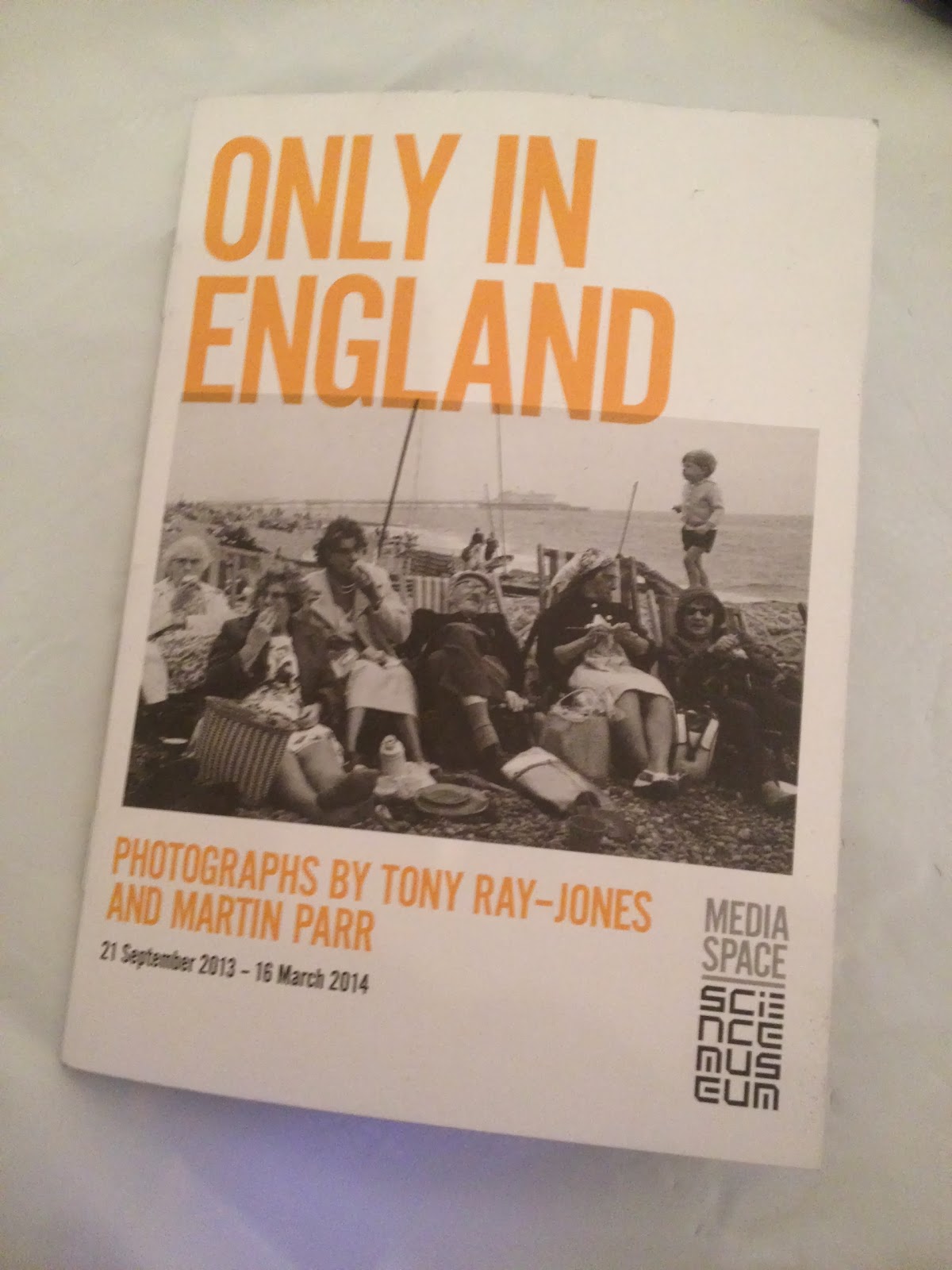
Photographer - Tony Ray Jones at the Science Museum


It was an entry in the wonderfully enigmatic and polemic quarterly Art magazine Jackdaw where I came across the work of Tony Ray Jones a British photographer who died all too young aged 31 back in 1972. His work is being shown at the ONLY IN ENGLAND exhibition at the Science Musuem's new Media Space.

He took the US documentary photography found in Walker Evans and more recently in the rediscovered Vivian Maier and gives it a very British look and feel. Where those US photographers used the streets and bars and to lesser extent their countryside Tony Ray Jones use the beach and the countryside to capture the British zeitgeist.

My two favourites from the exhibition which demonstrated British eccentricity and idiosyncracity at home on the beach and the countryside are:  Brighton Beach 1966 (I've been in similar seaside family pictures) and Glyndebourne, 1967 (a scene I 'm  sure you can see today!)
Glyndebourne, 1967

Brighton Beach, 1966
From a page on show from his  c1965 notebook  you can find tips and ideas which resonate today in our digital photography  age. I found stay with the subject matter (be patient) and get involved (talk to people) particularly relevant to me.


And yes, I did look for the Blacks and they were there both fictive aka in the blackened white faces style of the Black & White Minstrels, in the oddly named Bacup Coconut Dancers who seemed to be related to the equally odd Morris Dancer and yes both groups have there history 'lost in the mists of time' . There were of course some real blacks caught in the streets of Tony Ray Jones's London in 60's and 70's
Bacup Coconut Dancers, 1968

A good exhibition very intsrtuctive - recommended!

PS while doing the research for this post I came across the blog post of Blake Andrews in which he talks about rephotography, I have been meaning to do similar with a Jimi Hendrix picture....watch this blog


Monday, 23 September 2013

Another Bluebird ?

Belonging Walker Gallery Installation for Liverpool Biennial 2012. Image by © Mark McNulty 

Following on from my post about Katharina Fritsch’s Hahn/Cock  maybe this single colour bird thing is becoming a fashion ?

In an installation for last year's Liverpool's Biennal in an around its neo-classical Walker Art Gallery an artist uses multi-colour magnitude rather than the monochrome mass used by Fritsch in an attempt to create an aesthetic effect.

Belonging Walker Gallery Installation for Liverpool Biennial 2012.  Image by © Mark McNulty

Patrick Murphy’s Belonging is 150 ‘brightly coloured guests’ aka Ken Livingston's "rats with wings" aka pigeons painted various garish colours as appose to Katharina Fritsch’s Hahn/Cock single, 800kg bird. Murphy argues:
Belonging elevates the familiar site of pigeons [to] welcome, colourful visitors….. [evoking] questions about ownership and feelings of being accepted or marginalised. 
Belonging Walker Gallery Installation for Liverpool Biennial 2012 Image by © Mark McNulty 

I leave you to decide, for me Belonging is shop bought art, kitsch like Fritsch's.

Monday, 16 September 2013

A Cock-Up on the Fourth Plinth ?

Katharina Fritsch’s Hahn/Cock 
Aug '13 Photo © The Author
The pieces chosen for the fourth plinth in London's Trafalgar Square seem to be falling into the same pattern of much of contemporary  public art  today; they're Big, they're in a Unlikely place and they're Monochrome.

Look at Jaume Plensa’s Dream, visible from the M62 on the way into Liverpool; a white, 20m high structure of the thin, ashen face of a nine year old child; the planned Ebbsfleet Landmark Project By  Mark Wallinger at 40 to 50m impossibly, high white horse by the A2 visible to drivers to and from Ebbsfleet; Damien Hirst’s 20m Verity sinisterly, overlooking Ilfracombes’s harbour

The fourth plinth works seem to following this contemporary convention as most have been big pieces, in the unlikely setting of the plinth and with few exceptions, monochrome as seen in Elmgreen and Dragset , Powerless Structures, Fig. 101 or Marc Quinn’s Alison Lapper Pregnant and now Katharina Fritsch’s Hahn/Cock its plaque reads:
Hahn/Cock is a sculptre of a familiar domestic cockerel in ultramarine blue, made from fibre glass reinforced resin and fixed on a stainless-steel support structure.
The sculpture is 4.72 Meters high and weighs 800kg
Further that commonality of compositions perhaps has it source in the fact that three out of the six works artists’ share the same dealer – the White Cube – despite there being of thousands of dealers across the country with at least 500 in London.

Elmgreen and Dragset , Powerless Structures, Fig. 101 
Photo Aug '12 © The Author 


Marc Quinn’s Alison Lapper Pregnant
Photo Feb '07 © Fred Penfold
The artists invariably claim to bring ‘fun’ to art as well as addressing issues on the borders of some human emotion or physical dilemma. In Fritsch’s case  Hahn/Cock  “plays on the tension between reality and apparition, between the familiar and the surreal or uncanny” according to her publicists aka dealers - White Cube - on their web site.

For me, there is no aesthetic content in this cock at all, it is kitsch; on a par with mass produced blow moulded wellington boots ‘She captures and magnifies the uncanny’ her defenders say. Cock, uncanny ? Sigh!  Nonsense!

National Gallery, St Martin's, Hahn/Cock, Nelsons's Column
Photo Aug'13 © The Author and iPhone
This is art as spectacle, for tourists. This is ornamentation. Decoration. A backdrop to countless thousands of Trafalgar Square sightseers’ digital photographs, period.

There has been one work on the plinth that has worked for me, Yinka Shonibare's Nelson's Ship in A Bottle. Yes,  it's a cliché, a re-working of his trade-mark wax cloths nevertheless it works for me, proof that Fourth Plinth art can be more than a Big piece in an Unlikely place and Monochrome!

Yinka Shonibare, Nelson’s Ship in a Bottle
Photo Sometime after May '10  © The Author