Friday, 28 September 2012

GR8 USE OF TXT BUT NOT GR8 CAUZ


Delighted to see the National making use of QR codes but saddened by the use case.


The National's QR code was real easy to  use; seamlessly making link from the real to the virtual world and back again. I scanned the code using an app on my iPhone almost by return I was presented with a text  message screen ready for me to text 'POUSSIN' to the short code 70880 so no need to type in the number. Making it no problem  to donate £5 via my iPhone to the cause - raise £4M  of the £14M required to ‘save’ Poussin’s Extreme  Unction (Final Anointing) for the Cambridge’s  Fitzwilliam Museum and the nation as it was a 'national treasure'.

Extreme  Unction (Final Anointing)  [1638 -1640]

But I have to ask WHY? Couldn’t the National loan one of it’s 16 (sixteen) Poussin’s to the Fitzwilliam. In doing so free the £4M to fund some contemporary - local or international - art to inspire and enrich.

Yes, Posssin is important  but the nation has enough of his works,  in fact it is awash with Poussin’s paintings.  Poussins  can be found in Cambridge (they have one already so why be greedy?) Cardiff, Birmingham, Edinburgh and Liverpool  as well as in the collections of a number of Dukes.

So the nation is not short of a Poussin or two including several quintessential - 'national treasure' - Poussins  for example A Bacchanalian Revel before a Term 

A Bacchanalian Revel before a Term [1623-28]
So any artist in search of Poussinian education or inspiration  can easily seek out good examples of his characteristic painting style:
  • Linear frieze and triangular compostions
  • Use of primary and complimentary colours
  • History painting composition with its roots in the Renaissance work of Michelangelo and Raphael   
  • The painting’s narrative is revealed  thru gesture, body movement, hand and eye co-ordination
  • History or the Bible as the inspirational basis for each painting 
Just as so many artists have done  including David, Ingres, Cezzanne and even Picasso  in times past.

So, to conclude great to see this use of  'new technology' making the link from the real to virtual world  but let Extreme Unction go and use the money raised to help fund contemporary art we have enough Poussins!

Sunday, 1 April 2012

Team GB Kit Uses Ideas Seen In Leonardo da Vinci and 18th Century Horse Painter Paintings


Stella McCartney’s Team GB’s kit for the Olympics 2012 is my first chance to combine my interest in contemporary art and my Games Maker role in London.  I believe she has made masterful use of colour  and design to create not just specific and highly functional items of sportswear but an iconic, individual look and feel to for Team GB.


Her use of colour has come under attack as many argue there is not enough red attracting headlines such as the Guardian’s  22 March 2012 on the Internet Absence of red in outfits criticised by sports psychologist. Stella responded to this populist disapproval with a defiant tweet “The design actually uses more red & shows more flag than any Team GB kit since '84.”


I would argue her use of colour is brilliant and subtle taking full advantage of the eye’s physiological responses to a trick of perspective known and used by artist for centuries: the lighter the blue hue the more distant an object appears behind the picture plane while the colour red creates the opposite effect  as red objects appear to come out of the picture plane when set against an apparently distant blue object: the picture below demonstrates this visual effect.

The picture plane seems anchored by the black TEAM GB while the light blue TEAM GB  is perceived as behind the picture plane while the deep red TEAM GB is in front of the picture plane.

Leonardo used the effect in The Mona Lisa (1504)  where the distance rocks in the background behind the Madonna’s head are  painted in the palest of blues.  George Stubbs used the same effect in his painting William Anderson with Two Saddled Horses, 1793 the rider’s distinctive red frock coat makes him and his horse appear to be closer to the viewer than the riderless horse despite the reverse to be true on closer inspection. With the picture being given added depth by the persepcively distant mountains are in light blue.

Detail from Mona Lisa


Stubbs William Anderson with Two Saddled Horses, 1793

Stella’s use of red and blue has exactly those visual affects seen in the Leonardo and the Stubbs: reds advancing  effect is the first thing one seems to see when set against the kit’s dark and light blues . So the red of the Union jack is there it just does not appear to dominate the kit but it is the very first thing you see when you look at the kit – look again at the photo shoot picture.


Stella’s design reduces the red, white and blue of the  Union Jack to a monochrome design with different tones replacing the flags iconic colours. In doing so she creates a whole new palette of design elements taken from – a gold flag, a red flag, a blue flag - as exemplified by the background to the press release images.

She creatively takes these monochrome design fragments of the Union Jack – light and dark blue triangles and rectangles supported by even darker blue  rectangles. Collectively these fragments create the effect of being wrapped in the Union Jack as seen in the BMX star Shanaze Reade’s kit.

To conclude, Stella uses the iconic elements of the Union Jack   – its colours and its shapes -  to create a wonderfully diverse range of kits for the 38 Olympic and 22 Paralympic sports; maintaining each sport’s individuality  yet uniting the Team collectively under the Union Jack in a dramatic, eye-catching  twenty-first century look and feel, she is to be congratulated not castigated. It takes a step on the road to to the super human performances needed to win gold!

Wednesday, 14 March 2012

Wonderfully Weathered Wood In Dortmund

As all the usual hotels I stay at in at Dortmund were full I was forced to stay at an anonymous, box like hotel on a dreek Industrial Estate(IE) on the edge of the city. To add insult to injury I was charged a rip-off rate taking advantage of the city being full. – normally for B&B in Dortmund I pay 55 Euro tonight it was paying 99.5 Euro – 4 star price at 1 star hotel.

To cheer myself up the next morning I went for stroll around the estate and to my delight and surprise came across Hecker’s in the middle of this wasteland of functional buildings and spaces. Hecker’s was a conventional IE building – built as a price per square foot modernist box with much use of glass and steel and metal cladding with little architectural imagination and surrounded by assiduously marked out car parking space, with a grassed area to the side.


The grassed area was serene - a little oasis - a pool surrounded by steep banks with mixed green vegetation and the most wonderful, roughly-hewn, slenderly-shaped wooden figures and shapes in groups of three. The figures rose like totems commanding the space around them.

The whole Hecker plot and building was decorated with these wonderfully weathered wooden figures and shapes often in groups of three  Not so much a building and a car park more a sculpture park on a par with Yorkshire Sculpture  Park.  A pleasing distraction from the depression of the hotel and the Industrial Estate and their dour glass, steel and concrete edifices  A very pleasant surprise!

Monday, 1 November 2010

Christian Marclay’s The Clock at the White Cube Gallery


A stopped clock is right twice a day trouble is you just don’t know when – Christian Marclay’s The Clock on show at the White Cube Gallery , uses 24 hours’ worth of shots and clips of stopped, stopping clocks from over 3,000 movies to create a synchronised, real-time working clock to solve that problem.

The Clock was brought to my attention by a tweet from Waldemar Januszczak. I follow @Januszczak as we admire many of the same artists and I like his work with his ZCZ film company and

we share a common passion for the Sistine Chapel and the work of Michelangelo Buonarroti . So although normally I have no time for video art - I’m no fan of art that needs to be plugged in - a recommendation from him sparked my interest. And I was AMAZED.

This is a brilliant, innovative idea : a collage which at once both aesthetic and practical - art for art’s sake yet it’s art with a purpose – it’s a real functioning clock which is a delight to watch.

The staging is the bowels of The White Cube gallery set up like a giant living room with large, comfy sofas and a huge screen with great sound.


I took my seat and immediately checked my watch and blow me if it wasn’t 4:55 on my watch but also on screen!....4:59....than bang!...5pm...I was watching time or was I watching the narrative which cut from one scene to another. Time seemed to pass so quickly, a very strange experience as I tried to follow and anticipate the narrative which made sense one moment only to break down and morph into another story in the next minute – all done effortlessly in time, on time.

I’m not a film buff but even I recognised some scenes from Casablanca and Brief Encounter and even a few actors Dirk Bogart , Clint Eastwood and Alistair Sims. But the majority of The Clock’s shots where unknown to me and not just the German, French, Japanese, Bollywood scenes but also the block busters, such is my ignorance. It was great fun to see something you vaguely know or recognise – an actor, a scene , a building , whatever only to have it morph seamlessly into something you didn’t know or recognise. The ever present time either spoken or shown flawlessly moving the disjointed, fractured story on – wonderful!

Available for £500,000 (including hard drive!) from an edition of six and two artist copies to private collectors and museum The Clock would make a brilliant addition to the reception of any company wishing to keep track of its own time.

You can watch The White Cube's Clock for free now , but hurry this Clock stops on the 11th Nov.....at the 11th hour?

Recommended, you'll be amazed.

Reference...

Tuesday, 10 August 2010

Gagosian Gallery's PICASSO: The Mediterranean Years (1945-1962)

Bikini, Feb 27 1961

Gagosian Gallery's PICASSO: The Mediterranean Years (1945-1962) is a wonderfully and thoughtfully curated exhibition which vividly shows what a prolific, prodigious and catholic genius Picasso was - from his delicate small three dimensional origami like paper and cardboard works presented by the Gallery in conventional glass cases to a painted door presented complete with its hinges and doorstep screwed to the wall, as if waiting to be opened. Gagosian's exhibition shows Picasso's genius for consuming and transforming a huge range of media - pen and ink, tiles and bricks, bronze , wood, cardboard and paper.

The exhibition is well described elsewhere for example here and here.

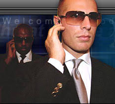
This review will focus on two works and a curatorial scheme/installation that caught my eye as examples of how good this exhibition really is. Regrettably security was too tight to take any pictures –men in dark suits some with the classic CIA ear piece connecting them to some unseen central control were everywhere I looked – three or four per room.

But my lack of pictures is made up by the excellent Gagsocian web site supporting the exhibition which has a good selection of pictures of exhibited works and an excellent video which thoughtfully walks you through the show.

The Two Pieces

La Taureau (The Bull) Dec 5 1945 to Jan 17 1946

Eleven 29 by 41 cm Lithographs of a lone Bull framed in black and hung in a single horizontal row at (my!) eye level .

Taken as a group the eleven Bull Lithographs are a tour through Art History of the nineteenth and early twentieth centuries.

Realism of the mid nineteenth represented by the first lithographs of a fully-formed, massive Bull giving way to late nineteenth century’s Impressionism with the Bull drawn quickly with Impressionism’s fast, light pen strokes capturing the moment as the Bull tail swirls.

There follows Cubism’s faceted planes – early twentieth century - which are used to deconstruct the Bull’s substantial form which Picasso progressively breaks down from planes into lines – from three to two dimensions.

By the final lithograph on this Art Historical journey, Picasso's Bull has lost its mass entirely. The Bull is reduced to a few pen strokes his huge , powerful head has been précised to a pinhead, his magnificently rendered horns mere sticks in stark contrast to Realism’s Bull with its massive head and menacing horns. Picasso is in total control of the journey from Realism to the edge of Abstract – Brilliant!

Bikini, Feb 27 1961

Bikini is the first piece that one encounters on entering the exhibition - it made me smile!

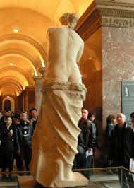
It is Picasso at his most playful and mischievous. He takes an essentially innocent object – an unglazed terracotta vase about one meter high –and with a couple of judiciously, incised lines and few splashes of yellow paint he creates the torso of a slim-waisted female putting me in mind of the Venus de Milo .

Bikini is on a small plinth behind glass with mirror on three sides giving a full and explicit view of the entire work in the round. What I found so convincing were the lines creating the back bone and the buttocks. Picasso translates a two dimensional line drawing into three dimensions - maintaining the elegant simplicity of the drawing.

I was also minded of one of my favourite and wittiest works by Picasso – Still Life with Pitcher and Apples, 1919. Here he places a jug on a table with two apples either side of it with a further two apples on plate positioned top of the jug. Innocent enough? On the on hand yes – this is a low, dimly lit; compressed and flattened picture space painted with a muted palette of greys, yellows and greens. On the other hand the painting – like Bikini – can be read as play on the female torso: the apples as breasts the buttocks as the body of the jug. Pitchers and Apples sexual inference is more subtle than that found in Bikini nevertheless they both show Picasso’s wit as well as his genius for helping us to re-examine our world around us


The Installation

There is a dimly lit passage about seven meters long linking one exhibition space to another whose walls are made of glass. Behind the glass walls are spot lit plinths upon which are mounted some works in wood and bronze. It is the bronze works which are this most eye catching through the spot-lighting.

The installation seems to be a homage to the Royal Academy’s controversial 1995 exhibition Africa: The Art of an Continent , with its darkened rooms and spot light objects which some at the time had argued the exhibition had late nineteenth century notions of the ‘dark continent’ . The installation presents Picasso’s work like those of the Royal Academy’s Africa exhibition and the same presentation can be found today in the British Museum’s Africa Galleries. The Gagosian installation clearly makes manifest the influence of Africa on Picasso’s art.

Summary

This is a superb exhibition, its range and depth is stupendous showing Picasso as the genius whose shadow was cast over virtually all art of the twentieth century leaving no media or form untouched by the incredible brilliance of Picasso's eye, hand and mind – Gagosian Gallery's PICASSO: The Mediterranean Years (1945-1962) recommended without reservation.


Wednesday, 21 October 2009

American Abstract Expressionism meets Russian Constructivism South African Mountain Biking

Read a piece in the Times the other day about a South African mountain biking photograph by Gary Parkin part of The Times "Story Behind The Picture" series it immediately made me think of Rothko modernism colour fields and Rodchenko black and white Constructivist photographs.
This is what I saw......what do you think?

Saturday, 10 October 2009

Dada, Che & Obama Say Trust Me

When I saw the ex-Dadist John Heartfiels’s photomontage cover for the June 1934 issue of the communist magazine AIZ Arrbeiter Illustrierte Zeitung (AIZ: Workers Illustrated Paper) en titled ‘A New Man – Master of a New World. I was struck how similar the pose was to the picture of Che Guevara on thousands of student walls and T-shirts and Shepherd Fairey’s HOPE poster of Presidential candidate Barrack Obama both have become icons.

John Heartfeild the ex-Dadaist produced a series of monthly photomotages montages
Heartfield positioning the worker as a man of vision in a new age at time of rising unemployment and political strife

See for yourself ,c lick here.

All three have men staring upwards with gravitas as a friend said a calm-assertive "trust me" look.

Having identified the pose the challenge is now to find when the pose was first used. I suspect the Romans may have got their first as they have in so many things; they were the masters at propaganda.

Picture credits

1930s
Plate 5 from
Gaiger, J.M., Wood P. (eds) (2003) Art of the Twentieth Century – A Reader, New Haven and London, Yale University Press

1960s
Alberto Korda took the iconic picture of Che Geuvara on March 5, 1960 while working for the Cuban newspaper Revolución.

2000s
Shepherd Fairey’s 2008 HOPE poster for the Obama presidential campaign was based on a copyrighted photograph taken in April 2006 by Mannie Garcia while on assignment for the Associated Press (AP)