Monday, 1 November 2010

Christian Marclay’s The Clock at the White Cube Gallery


A stopped clock is right twice a day trouble is you just don’t know when – Christian Marclay’s The Clock on show at the White Cube Gallery , uses 24 hours’ worth of shots and clips of stopped, stopping clocks from over 3,000 movies to create a synchronised, real-time working clock to solve that problem.

The Clock was brought to my attention by a tweet from Waldemar Januszczak. I follow @Januszczak as we admire many of the same artists and I like his work with his ZCZ film company and

we share a common passion for the Sistine Chapel and the work of Michelangelo Buonarroti . So although normally I have no time for video art - I’m no fan of art that needs to be plugged in - a recommendation from him sparked my interest. And I was AMAZED.

This is a brilliant, innovative idea : a collage which at once both aesthetic and practical - art for art’s sake yet it’s art with a purpose – it’s a real functioning clock which is a delight to watch.

The staging is the bowels of The White Cube gallery set up like a giant living room with large, comfy sofas and a huge screen with great sound.


I took my seat and immediately checked my watch and blow me if it wasn’t 4:55 on my watch but also on screen!....4:59....than bang!...5pm...I was watching time or was I watching the narrative which cut from one scene to another. Time seemed to pass so quickly, a very strange experience as I tried to follow and anticipate the narrative which made sense one moment only to break down and morph into another story in the next minute – all done effortlessly in time, on time.

I’m not a film buff but even I recognised some scenes from Casablanca and Brief Encounter and even a few actors Dirk Bogart , Clint Eastwood and Alistair Sims. But the majority of The Clock’s shots where unknown to me and not just the German, French, Japanese, Bollywood scenes but also the block busters, such is my ignorance. It was great fun to see something you vaguely know or recognise – an actor, a scene , a building , whatever only to have it morph seamlessly into something you didn’t know or recognise. The ever present time either spoken or shown flawlessly moving the disjointed, fractured story on – wonderful!

Available for £500,000 (including hard drive!) from an edition of six and two artist copies to private collectors and museum The Clock would make a brilliant addition to the reception of any company wishing to keep track of its own time.

You can watch The White Cube's Clock for free now , but hurry this Clock stops on the 11th Nov.....at the 11th hour?

Recommended, you'll be amazed.

Reference...

Tuesday, 10 August 2010

Gagosian Gallery's PICASSO: The Mediterranean Years (1945-1962)

Bikini, Feb 27 1961

Gagosian Gallery's PICASSO: The Mediterranean Years (1945-1962) is a wonderfully and thoughtfully curated exhibition which vividly shows what a prolific, prodigious and catholic genius Picasso was - from his delicate small three dimensional origami like paper and cardboard works presented by the Gallery in conventional glass cases to a painted door presented complete with its hinges and doorstep screwed to the wall, as if waiting to be opened. Gagosian's exhibition shows Picasso's genius for consuming and transforming a huge range of media - pen and ink, tiles and bricks, bronze , wood, cardboard and paper.

The exhibition is well described elsewhere for example here and here.

This review will focus on two works and a curatorial scheme/installation that caught my eye as examples of how good this exhibition really is. Regrettably security was too tight to take any pictures –men in dark suits some with the classic CIA ear piece connecting them to some unseen central control were everywhere I looked – three or four per room.

But my lack of pictures is made up by the excellent Gagsocian web site supporting the exhibition which has a good selection of pictures of exhibited works and an excellent video which thoughtfully walks you through the show.

The Two Pieces

La Taureau (The Bull) Dec 5 1945 to Jan 17 1946

Eleven 29 by 41 cm Lithographs of a lone Bull framed in black and hung in a single horizontal row at (my!) eye level .

Taken as a group the eleven Bull Lithographs are a tour through Art History of the nineteenth and early twentieth centuries.

Realism of the mid nineteenth represented by the first lithographs of a fully-formed, massive Bull giving way to late nineteenth century’s Impressionism with the Bull drawn quickly with Impressionism’s fast, light pen strokes capturing the moment as the Bull tail swirls.

There follows Cubism’s faceted planes – early twentieth century - which are used to deconstruct the Bull’s substantial form which Picasso progressively breaks down from planes into lines – from three to two dimensions.

By the final lithograph on this Art Historical journey, Picasso's Bull has lost its mass entirely. The Bull is reduced to a few pen strokes his huge , powerful head has been précised to a pinhead, his magnificently rendered horns mere sticks in stark contrast to Realism’s Bull with its massive head and menacing horns. Picasso is in total control of the journey from Realism to the edge of Abstract – Brilliant!

Bikini, Feb 27 1961

Bikini is the first piece that one encounters on entering the exhibition - it made me smile!

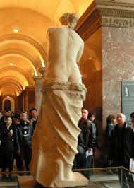
It is Picasso at his most playful and mischievous. He takes an essentially innocent object – an unglazed terracotta vase about one meter high –and with a couple of judiciously, incised lines and few splashes of yellow paint he creates the torso of a slim-waisted female putting me in mind of the Venus de Milo .

Bikini is on a small plinth behind glass with mirror on three sides giving a full and explicit view of the entire work in the round. What I found so convincing were the lines creating the back bone and the buttocks. Picasso translates a two dimensional line drawing into three dimensions - maintaining the elegant simplicity of the drawing.

I was also minded of one of my favourite and wittiest works by Picasso – Still Life with Pitcher and Apples, 1919. Here he places a jug on a table with two apples either side of it with a further two apples on plate positioned top of the jug. Innocent enough? On the on hand yes – this is a low, dimly lit; compressed and flattened picture space painted with a muted palette of greys, yellows and greens. On the other hand the painting – like Bikini – can be read as play on the female torso: the apples as breasts the buttocks as the body of the jug. Pitchers and Apples sexual inference is more subtle than that found in Bikini nevertheless they both show Picasso’s wit as well as his genius for helping us to re-examine our world around us


The Installation

There is a dimly lit passage about seven meters long linking one exhibition space to another whose walls are made of glass. Behind the glass walls are spot lit plinths upon which are mounted some works in wood and bronze. It is the bronze works which are this most eye catching through the spot-lighting.

The installation seems to be a homage to the Royal Academy’s controversial 1995 exhibition Africa: The Art of an Continent , with its darkened rooms and spot light objects which some at the time had argued the exhibition had late nineteenth century notions of the ‘dark continent’ . The installation presents Picasso’s work like those of the Royal Academy’s Africa exhibition and the same presentation can be found today in the British Museum’s Africa Galleries. The Gagosian installation clearly makes manifest the influence of Africa on Picasso’s art.

Summary

This is a superb exhibition, its range and depth is stupendous showing Picasso as the genius whose shadow was cast over virtually all art of the twentieth century leaving no media or form untouched by the incredible brilliance of Picasso's eye, hand and mind – Gagosian Gallery's PICASSO: The Mediterranean Years (1945-1962) recommended without reservation.


Wednesday, 21 October 2009

American Abstract Expressionism meets Russian Constructivism South African Mountain Biking

Read a piece in the Times the other day about a South African mountain biking photograph by Gary Parkin part of The Times "Story Behind The Picture" series it immediately made me think of Rothko modernism colour fields and Rodchenko black and white Constructivist photographs.
This is what I saw......what do you think?

Saturday, 10 October 2009

Dada, Che & Obama Say Trust Me

When I saw the ex-Dadist John Heartfiels’s photomontage cover for the June 1934 issue of the communist magazine AIZ Arrbeiter Illustrierte Zeitung (AIZ: Workers Illustrated Paper) en titled ‘A New Man – Master of a New World. I was struck how similar the pose was to the picture of Che Guevara on thousands of student walls and T-shirts and Shepherd Fairey’s HOPE poster of Presidential candidate Barrack Obama both have become icons.

John Heartfeild the ex-Dadaist produced a series of monthly photomotages montages
Heartfield positioning the worker as a man of vision in a new age at time of rising unemployment and political strife

See for yourself ,c lick here.

All three have men staring upwards with gravitas as a friend said a calm-assertive "trust me" look.

Having identified the pose the challenge is now to find when the pose was first used. I suspect the Romans may have got their first as they have in so many things; they were the masters at propaganda.

Picture credits

1930s
Plate 5 from
Gaiger, J.M., Wood P. (eds) (2003) Art of the Twentieth Century – A Reader, New Haven and London, Yale University Press

1960s
Alberto Korda took the iconic picture of Che Geuvara on March 5, 1960 while working for the Cuban newspaper Revolución.

2000s
Shepherd Fairey’s 2008 HOPE poster for the Obama presidential campaign was based on a copyrighted photograph taken in April 2006 by Mannie Garcia while on assignment for the Associated Press (AP)

1968 Art Critic Quotes Views of 1850’s Racialist as Truth

While revising the subject of Primitivism for my exam next week I looked up the word up in a book I’d brought ages ago. The author was Sir Herbert Read (1893–1968) , the book was the ‘new and revised’ 1968 edition of his pocket book The Meaning of Art a standard introductory text to art based on articles for the now defunct magazine The Listener – the BBC’s weekly literary journal. On page 76 he describes the ‘Negro’ as follows

Indeed it has been said with truth by Count Gobineau the Negro possess in the highest degree that sensual faculty which our civilised instincts tends to destroy, but without which no art is possible. It is certainly true that from a study of art of the Negro and Bushman we are led to an understanding of art in its most elemental forms and the elementary is always the most vital[1]

I could not believe it 1968 and he was quoting Count Joseph Arthur De Gobineau (1816-82). Gobineau - believed that

Inequality between the races was immutable- the superior. Of the three great graces in human history – the superior Aryan (white ) race the inferior yellow and black- the last two Untermenschen (literally , under peoples) enjoyed a propondence of numbers. [2]

The 1960s in art was a revolutionary time as there was the shift from modernism to postmodernism set against the historical backdrop of the Vietnam War, the rise of Feminism , Decoloniastion, Black power and swinging Sixties.

Yet here was a noted art critic writing for a prestigious journal , at the time, quoting the views on race almost century old, the mind boggles and the jaw drops.

But this is art history opinions and views with the occasional fact no matter how old and disputed.

Notes
[1] Read, pg 71
[2] King pg 103

References
King, C. (ed) (1999) Views of Difference: Different Views of Art, New Haven and London, Yale University Press
Read, H. (1968), The Meaning of Art, London, Faber & Faber

Wednesday, 26 August 2009

Barr Thinks MoMA is a Torpedo

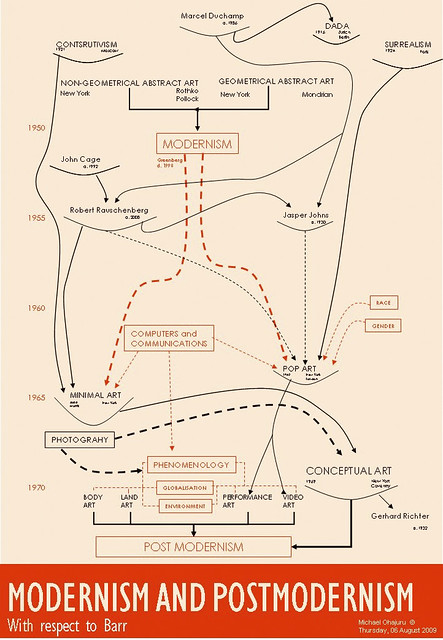
I was amazed to discover - thanks to my OU tutor - that Barr did indeed develop his chart idea but rather than use the graphical vocabulary of red and black with lines and type of varying size he changed not just his vocabulary but his language and grammar - from coloured lines and boxes to a torpedo! This takes art up to the 1950’s

It appears he sees MoMA’s permanent collection as a torpedo moving stealthily through the waters. .....

The Permanent collection may be thought of graphically as a torpedo moving through the time , the blunt end pushes into the advance field of art by means of the changing exhibitions. The bulk is made of accepted modern art. The tail tapers of into art which has become classical and is ready for the general museum. The torpedo moves forward acquiring, and retails its length of seventy years by giving to other museums [1]

At the time there was the 1934 MoMA exhibition ' Machine kind ' highlighting the Machine Aesthetic of the time so perhaps we could understand his metaphor of MoMA as a machine exemplified by the torpedo…understand it but not agree with it!

The mind boggles and the metaphors flow. Who was this torpedo aimed at? What waters were the Collection in ? What was the torpedo’s fuel, speed, engine, size ….and what do (could) they stand for? …and art renewing itself every 70 years , giving art to other ‘classical’ museums if not else Barr had a vision!

The drawings seem incomplete yielding none of overt and covert links his Chart revels, the torpedoes simply have a crude time line and artists and schools appropriately positioned along the line typed in the body of the torpedo.

There is some attempt to separate the European from non-European perhaps appealing to his target American audience but this is pretty crude. The torpedo metaphor lacks the didactic elegance of the Chart. There is no idea of the size or importance of the connections yielded by the Chart. So I regret to say the metaphor fails to produce a diagrammatic vocabulary in fact in contrast to the graphical richness of the Chart it became a simple language with one piece of grammar - a noun – the torpedo and that’s it!


[1] Annie Cohen-Solal quoting him in her article on Barr in Abstract expressionism: the internationally context, Issue 6512 edited Joan M. Marter

Friday, 7 August 2009

Professor Charles Harrison

It is with regret I learned of the death this week of Professor Charles Harrison, for me a real loss as he introduced me to the Renaissance and art history.

To me he was great communicator with a real touch for bringing Art to life in a compelling practical, no nonsense way. His video on Giotto’s Arena Chapel I’ve watched many times it was my introduction to Art History I recommend it to anyone who wants to see a master at work : he, to me, is the consummate communicator the equal of many of the familiar Art Historians we see on TV, people like Robert Hughes, Andrew Graham-Dixon, Vladimir Janscheck– Prof Harrison knew, loved his subject and could communicate it with ease and enthusiasm – he had a wonderful, laconic knowledgeable style with his careful, soft spoken English , to me a perfect presenter and lecturer.

As for his writing, it has been a central part of almost every OU course I’ve ever done: A103 his unit on Seeing I’ve used many times when I’m at a loss as how to view a work, he goes back to the basics giving me fresh view; AA315 his chapter on Durer is written like a who done it as he describes how artists copied each other an excellent read in its own right.

I had the pleasure on AX272 the Summer School to be conducted around the British Museum by Prof Harrison as he described how the human figure was translated by artists from earliest times – he knew and had a passion for his subject. And now most recently on AA318 I see his matter-of-fact, debunking approach when describes how to view a Pollock or how Conceptual art could be valued.

He was very modest as he was really part of the art history he wrote and spoke about – at an AX272 lecture he talked about as young man in New York sleeping on Greenberg’s floor! And we can see and read about his hand and guiding mind in Art & Language.

I am unashamedly a fan: for me he is what Art History is about and what Art History at the OU is about, I for one shall miss him.

With regret
Michael