I was amazed to discover - thanks to my OU tutor - that Barr did indeed develop his chart idea but rather than use the graphical vocabulary of red and black with lines and type of varying size he changed not just his vocabulary but his language and grammar - from coloured lines and boxes to a torpedo! This takes art up to the 1950’s
It appears he sees MoMA’s permanent collection as a torpedo moving stealthily through the waters. .....
The Permanent collection may be thought of graphically as a torpedo moving through the time , the blunt end pushes into the advance field of art by means of the changing exhibitions. The bulk is made of accepted modern art. The tail tapers of into art which has become classical and is ready for the general museum. The torpedo moves forward acquiring, and retails its length of seventy years by giving to other museums [1]
At the time there was the 1934 MoMA exhibition ' Machine kind ' highlighting the Machine Aesthetic of the time so perhaps we could understand his metaphor of MoMA as a machine exemplified by the torpedo…understand it but not agree with it!
The mind boggles and the metaphors flow. Who was this torpedo aimed at? What waters were the Collection in ? What was the torpedo’s fuel, speed, engine, size ….and what do (could) they stand for? …and art renewing itself every 70 years , giving art to other ‘classical’ museums if not else Barr had a vision!
The drawings seem incomplete yielding none of overt and covert links his Chart revels, the torpedoes simply have a crude time line and artists and schools appropriately positioned along the line typed in the body of the torpedo.
There is some attempt to separate the European from non-European perhaps appealing to his target American audience but this is pretty crude. The torpedo metaphor lacks the didactic elegance of the Chart. There is no idea of the size or importance of the connections yielded by the Chart. So I regret to say the metaphor fails to produce a diagrammatic vocabulary in fact in contrast to the graphical richness of the Chart it became a simple language with one piece of grammar - a noun – the torpedo and that’s it!
[1] Annie Cohen-Solal quoting him in her article on Barr in Abstract expressionism: the internationally context, Issue 6512 edited Joan M. Marter
Wednesday, 26 August 2009

Friday, 7 August 2009
Professor Charles Harrison
It is with regret I learned of the death this week of Professor Charles Harrison, for me a real loss as he introduced me to the Renaissance and art history.
To me he was great communicator with a real touch for bringing Art to life in a compelling practical, no nonsense way. His video on Giotto’s Arena Chapel I’ve watched many times it was my introduction to Art History I recommend it to anyone who wants to see a master at work : he, to me, is the consummate communicator the equal of many of the familiar Art Historians we see on TV, people like Robert Hughes, Andrew Graham-Dixon, Vladimir Janscheck– Prof Harrison knew, loved his subject and could communicate it with ease and enthusiasm – he had a wonderful, laconic knowledgeable style with his careful, soft spoken English , to me a perfect presenter and lecturer.
As for his writing, it has been a central part of almost every OU course I’ve ever done: A103 his unit on Seeing I’ve used many times when I’m at a loss as how to view a work, he goes back to the basics giving me fresh view; AA315 his chapter on Durer is written like a who done it as he describes how artists copied each other an excellent read in its own right.
I had the pleasure on AX272 the Summer School to be conducted around the British Museum by Prof Harrison as he described how the human figure was translated by artists from earliest times – he knew and had a passion for his subject. And now most recently on AA318 I see his matter-of-fact, debunking approach when describes how to view a Pollock or how Conceptual art could be valued.
He was very modest as he was really part of the art history he wrote and spoke about – at an AX272 lecture he talked about as young man in New York sleeping on Greenberg’s floor! And we can see and read about his hand and guiding mind in Art & Language.
I am unashamedly a fan: for me he is what Art History is about and what Art History at the OU is about, I for one shall miss him.
With regret
Michael
To me he was great communicator with a real touch for bringing Art to life in a compelling practical, no nonsense way. His video on Giotto’s Arena Chapel I’ve watched many times it was my introduction to Art History I recommend it to anyone who wants to see a master at work : he, to me, is the consummate communicator the equal of many of the familiar Art Historians we see on TV, people like Robert Hughes, Andrew Graham-Dixon, Vladimir Janscheck– Prof Harrison knew, loved his subject and could communicate it with ease and enthusiasm – he had a wonderful, laconic knowledgeable style with his careful, soft spoken English , to me a perfect presenter and lecturer.
As for his writing, it has been a central part of almost every OU course I’ve ever done: A103 his unit on Seeing I’ve used many times when I’m at a loss as how to view a work, he goes back to the basics giving me fresh view; AA315 his chapter on Durer is written like a who done it as he describes how artists copied each other an excellent read in its own right.
I had the pleasure on AX272 the Summer School to be conducted around the British Museum by Prof Harrison as he described how the human figure was translated by artists from earliest times – he knew and had a passion for his subject. And now most recently on AA318 I see his matter-of-fact, debunking approach when describes how to view a Pollock or how Conceptual art could be valued.
He was very modest as he was really part of the art history he wrote and spoke about – at an AX272 lecture he talked about as young man in New York sleeping on Greenberg’s floor! And we can see and read about his hand and guiding mind in Art & Language.
I am unashamedly a fan: for me he is what Art History is about and what Art History at the OU is about, I for one shall miss him.
With regret
Michael
Thursday, 6 August 2009
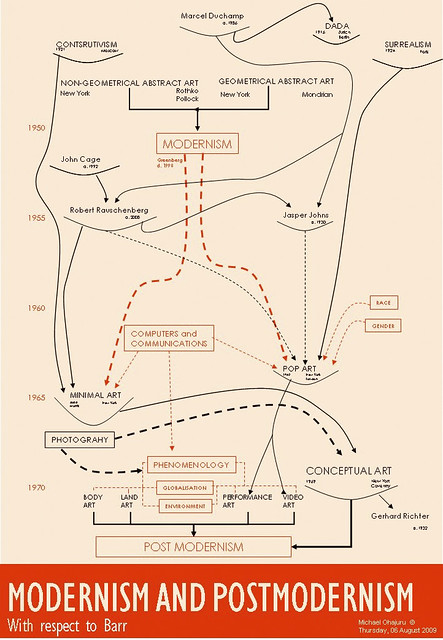
MODERNISM AND POSTMODERNISM Chart with respect to BARR
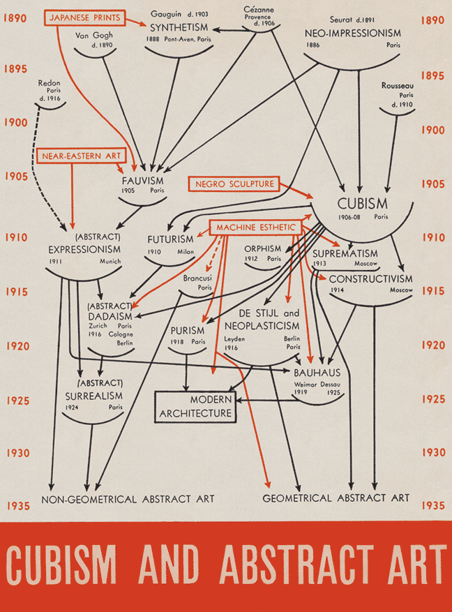
I’ve always toyed with the idea of updating Barr’s famous cover for the 1936 CUBISM AND ABSTRACT ART exhibition at MOMA, in New York.
I’ve already written about Barr's use of symbols - making the least possible change to make a point or have impact in his chart see here for the post.
The current essay on Conceptual Art following the last one on Minimalism and Pop Art was an opportunity to combine the Art History behind the two essays via a version of Barr’s chart back MODERNISM and POSTMODERNISM. In my version I wanted to trace all these practises back to Duchamp - the Father of Postmodernism. You can see my attempt here: MODERNISM and POSTMODERNISM with respect to BARR.
It's high level and misses a number of practices and I do play a little free with the exact times, maybe I’ve been too cavalier, too high level?….all feed back/comments welcome.
I’ve already written about Barr's use of symbols - making the least possible change to make a point or have impact in his chart see here for the post.
The current essay on Conceptual Art following the last one on Minimalism and Pop Art was an opportunity to combine the Art History behind the two essays via a version of Barr’s chart back MODERNISM and POSTMODERNISM. In my version I wanted to trace all these practises back to Duchamp - the Father of Postmodernism. You can see my attempt here: MODERNISM and POSTMODERNISM with respect to BARR.
It's high level and misses a number of practices and I do play a little free with the exact times, maybe I’ve been too cavalier, too high level?….all feed back/comments welcome.
Friday, 24 July 2009
Duchamp and the iPhone
There was an iPhone app called I am Rich for sale at 999.9$ which was withdrawn by Apple it simply displayed a multifaceted ruby . Apple’s reaction is similar to the reaction of the curators of the 1913 Armoury Exhibition.
The Armoury curators claimed they would exhibit any artist who had paid the entrance fee of 5$ but then went on to withdraw Duchamp’s Fountain, despite the fact he’d paid the entrance fee.
I’m sure you can see the connection - both I am Rich and Fountain appear on face value to have no artistic value but they have been given some measure of artistic value as indicated by thier price. I am Rich by a developer, Fountain by an artist…..which begs the questions what’s the difference between the developer and artist ? It could be argued there’s none…..
What caused the change Armory's curators change of heart? The same question could be asked of the folks at Apple…
Duchamp’s submission went onto to be voted, in the Independent newspaper’s poll of 500 UK art ‘experts’, to be the most influential work of art of the twentieth century. A Replica of Fountain was sold by Sotheby’s to Dimitri Daskalopoulos, a Greek collector, for $1,762,500. So maybe Apple are sitting on gold mine !
I never really ‘got’ it why Duchamp’s piece was so admired by so many ‘experts’ however having just done an essay comparing: Pollock –Modernism , Warhol – Pop Art and Morris – Minimalism. I can see the hand or at least the ideas of Duchamp his assisted readymades clearly inspired Warhol; he was a great supporter of Pollock; Morris’s geometrical shapes can be seen to be readymades.
Duchamp explored the idea of who is the author or artist ? What is the work or the piece of art ? What do we look for or expect of piece of art ? He challenged all these questions.
His Fountain broke the rules paving the way for Postmodernism where anything is art if ‘I’ the ‘artist’ say it’s ‘art’
Duchamp redefined what art was and who artist were in doing so broke Art free of medium specificity - freeing Art to be whatever the Artist thought Art to be.
It’s Art as I the Artist say it’s Art!
The Armoury curators claimed they would exhibit any artist who had paid the entrance fee of 5$ but then went on to withdraw Duchamp’s Fountain, despite the fact he’d paid the entrance fee.
I’m sure you can see the connection - both I am Rich and Fountain appear on face value to have no artistic value but they have been given some measure of artistic value as indicated by thier price. I am Rich by a developer, Fountain by an artist…..which begs the questions what’s the difference between the developer and artist ? It could be argued there’s none…..
What caused the change Armory's curators change of heart? The same question could be asked of the folks at Apple…
Duchamp’s submission went onto to be voted, in the Independent newspaper’s poll of 500 UK art ‘experts’, to be the most influential work of art of the twentieth century. A Replica of Fountain was sold by Sotheby’s to Dimitri Daskalopoulos, a Greek collector, for $1,762,500. So maybe Apple are sitting on gold mine !
I never really ‘got’ it why Duchamp’s piece was so admired by so many ‘experts’ however having just done an essay comparing: Pollock –Modernism , Warhol – Pop Art and Morris – Minimalism. I can see the hand or at least the ideas of Duchamp his assisted readymades clearly inspired Warhol; he was a great supporter of Pollock; Morris’s geometrical shapes can be seen to be readymades.
Duchamp explored the idea of who is the author or artist ? What is the work or the piece of art ? What do we look for or expect of piece of art ? He challenged all these questions.
His Fountain broke the rules paving the way for Postmodernism where anything is art if ‘I’ the ‘artist’ say it’s ‘art’
Duchamp redefined what art was and who artist were in doing so broke Art free of medium specificity - freeing Art to be whatever the Artist thought Art to be.
It’s Art as I the Artist say it’s Art!
Sunday, 12 July 2009
Banksy versus Bristol Museum
Went to see Banksy versus Bristol Museum yesterday and had very enjoyable day despite the one and half hour queue....
It was a chance to see Banksy's work close up and make comparisons with my AA318 Open University Art of the Twentieth Century eye. On a personal basis I loved the paintings and sculpture, they were consistently witty and incisive often very cutting. It was fun to move around freely and take pictures, Banksy seems to turn copyright on its head making it his (and our) right to copy what we like, as he let's all and sundry copy him, just as he copies or rather steals from others!
None of the pictures, bar one had a plaque – that I could see – so I believe we were left to form our own opinion unmediated by the artist's or museum's thoughts and ideas.
I saw his work having two recurring themes :
ONE HeartField's Juxtaposition - a subversive, humorous often political message where, for example he contrasts two extremes the loving, caring mother with aggressive anti establishment off spring; the overweight well fed tourist in colour with their poor, under nourished rickshaw driver in black and white. He reserves much of his ironic contrasts for the riot police which he has gamboling thorough a grassy field or traveling on a rocking horse or escorting a donut(!) Where Heartfield dramatically contrasts two strong, often cliche images to create a third, Banksy is not so angry or fighting for a political cause like Heartfeild. Banksy's images are often softer not so menacing but nevertheless can carry a cutting message.
TWO Duchamp's assisted readymades: here Banksy copies Duchamp's idea of taking a known picture and adding his own twist to make a new image - as Duchamp twists Leonardo, so Banksy twists Rembrandt.
So at one level he's just copying and stealing, what makes his work special and original is the media which he has made his own – the use of stencil and Graffiti techniques. When his technique is coupled with his anti-establishment, mysterious, Scarlet Pimpernel like public character, taken together they make him a compelling twenty first century artist.
It was a chance to see Banksy's work close up and make comparisons with my AA318 Open University Art of the Twentieth Century eye. On a personal basis I loved the paintings and sculpture, they were consistently witty and incisive often very cutting. It was fun to move around freely and take pictures, Banksy seems to turn copyright on its head making it his (and our) right to copy what we like, as he let's all and sundry copy him, just as he copies or rather steals from others!
None of the pictures, bar one had a plaque – that I could see – so I believe we were left to form our own opinion unmediated by the artist's or museum's thoughts and ideas.
I saw his work having two recurring themes :
ONE HeartField's Juxtaposition - a subversive, humorous often political message where, for example he contrasts two extremes the loving, caring mother with aggressive anti establishment off spring; the overweight well fed tourist in colour with their poor, under nourished rickshaw driver in black and white. He reserves much of his ironic contrasts for the riot police which he has gamboling thorough a grassy field or traveling on a rocking horse or escorting a donut(!) Where Heartfield dramatically contrasts two strong, often cliche images to create a third, Banksy is not so angry or fighting for a political cause like Heartfeild. Banksy's images are often softer not so menacing but nevertheless can carry a cutting message.
TWO Duchamp's assisted readymades: here Banksy copies Duchamp's idea of taking a known picture and adding his own twist to make a new image - as Duchamp twists Leonardo, so Banksy twists Rembrandt.
So at one level he's just copying and stealing, what makes his work special and original is the media which he has made his own – the use of stencil and Graffiti techniques. When his technique is coupled with his anti-establishment, mysterious, Scarlet Pimpernel like public character, taken together they make him a compelling twenty first century artist.
Sunday, 5 July 2009
20th Century Art ? It's about bridging gaps.....isn't it?
It occurred to while reading that Warhol might be seen as 'bridg[ing] the gap between art and production' (Wood, 2004 ) much of what I’ve studied so far might also be seen as bridging gaps:
Picasso the gap between realism and abstraction.
That is a bit far fetched but it is the basis of in an interesting essay.......
On the other hand the concept does seem a useful starting pointing trying to understand and position the artist or the movement. Equally it could be basis for some new art forms how about…….
the gap between to the performance and painting
the gap between minimalist art and conceptual art
the gap between body art and land art (!)
Bibliography
Wood, P ed., (2004) Varieties of Modernisms , New Haven and London, Yale University Press
May be even..
- Duchamp the gap between art and non-art
- Surrealism the gap between reality and unreality
- Pollock gap between the easel and mural
- Minimalist the gap between painting and sculpture
- Pop art the gap between avant-garde and kitsch
- DaDa the gap between artist and non-artist
Picasso the gap between realism and abstraction.
That is a bit far fetched but it is the basis of in an interesting essay.......
On the other hand the concept does seem a useful starting pointing trying to understand and position the artist or the movement. Equally it could be basis for some new art forms how about…….
the gap between to the performance and painting
the gap between minimalist art and conceptual art
the gap between body art and land art (!)
Bibliography
Wood, P ed., (2004) Varieties of Modernisms , New Haven and London, Yale University Press
Monday, 22 June 2009
What is minimalism?
- An emphasis on the literal nature of an object as physically encountered in real time and space (PL)
- The need to explicitly acknowledge three dimensionality (PL)
- ABC Art , Cool Art, Literal Art, Primary Structure, Specific Structures
- Straddles the categories of painting and sculpture (AR)
- Uningratiating, unsentimental, unbiographical (AR)
- Preoccupied with the boundary between art and non art (CG)
- The theatricality of objecthood (MF)
- A feat of ideation (CG)
- Something deduced (CG)
- One of the primary legacies of the 1960s (AR)
- Independent art on an [equal] footing with modernist painting and modernist sculpture (MF)
- Is theatre...as it is concerned with the actual circumstances in which the beholder encounters [minimalist] work. (MF)
- Confrontation as the minimalist work must somehow confront the viewer (MF)
- Anthropomorphism - as it lies at the 'core' of minimalist theory and practice (MF)
A minimalist work of art such as Frank Stella's 1960 Six Mile Bottom , is one in which the viewer , curator and artist all take part to create a piece of theatre developing the idea first indentified by the artist presented by the curator and viewed by the spectator - see 1966 exhibition Primary Structures . It is not a painting nor is a sculpture it is an object with its own individual site specific anamorphic identity.
MF - Michael Fried
'Art and Objecthood' (1967) Art in Theory VIIA7 pp835-46
PL - Paul Leider , Literalism and Abstraction (1970)
Gaiger, J.M.(eds) (2003) Art of the Twentieth Century – A Reader, New Haven and London, Yale University Press
CG - Clement Greenberg Minimalism’s Situation
Wood, P., (1999) Varieties of Modernism, New Haven and London, Yale University Press
AR - Anne Reynolds Minimalism’s Situation
Wood, P., (1999) The Challenge of the Avant-Garde, New Haven and London, Yale University Press
Subscribe to:
Posts (Atom)